Little Choc Apothecary
Recently, I had the pleasure to redesign/refresh the logo for NYC’s first fully vegan creperie, Little Choc Apothecary in Brooklyn. I was so thrilled to work on this project because the cafe has such a fun vibe, it’s almost like a work of art in itself, both in its interior design and its beautiful (and delicious) food.
Client: Little Choc Apothecary


These are the original logos the cafe has used since its beginnings. The owner loved the feeling and colors of these logos but wanted to update the image and text. The main issues with these were that the illustration itself was a bit too detailed for a logo, making it not as clear when printing, the chocolate inside the mouth did not read as chocolate clearly to some people, and text on the first logo was a bit small. Our main goal was to make the text pop more while keeping the overall feeling of the original logo, so that it didn’t look too jarringly unrecognizable to customers.

Sketching this logo out was incredibly fun. I wanted to give the client a lot of options, not just ones with the original mouth image, as I thought there were so many different ways it could go. The cafe has a very extensive loose tea collection and often posts beautiful photographs of its colorful teapots and vintage cups, so for some of these, I incorporated a teapot or a tea cup to reference this. I knew that I wanted to stay away from crepe images, even though this is a creperie, as this felt too obvious and extremely overused by most creperies.

Ultimately, the client decided to go with the mouth image direction, as it most closely referenced the original logo. The major updates to this logo were making the mouth much simpler and more graphic, having the text run across so that it could be larger and grab much more attention, and removing the chocolate piece originally in the logo. We tried several different type directions inside the banner here.

The simpler text ended up winning over as it was the most readable at all sizes. For the smallest sizes, I removed the strokes next to the letters, as they would get too small to be very visible or to print properly.

A fully black and white version of the main logo was created with the same specifications as for the full version to print on colored materials or when color printing is not available,
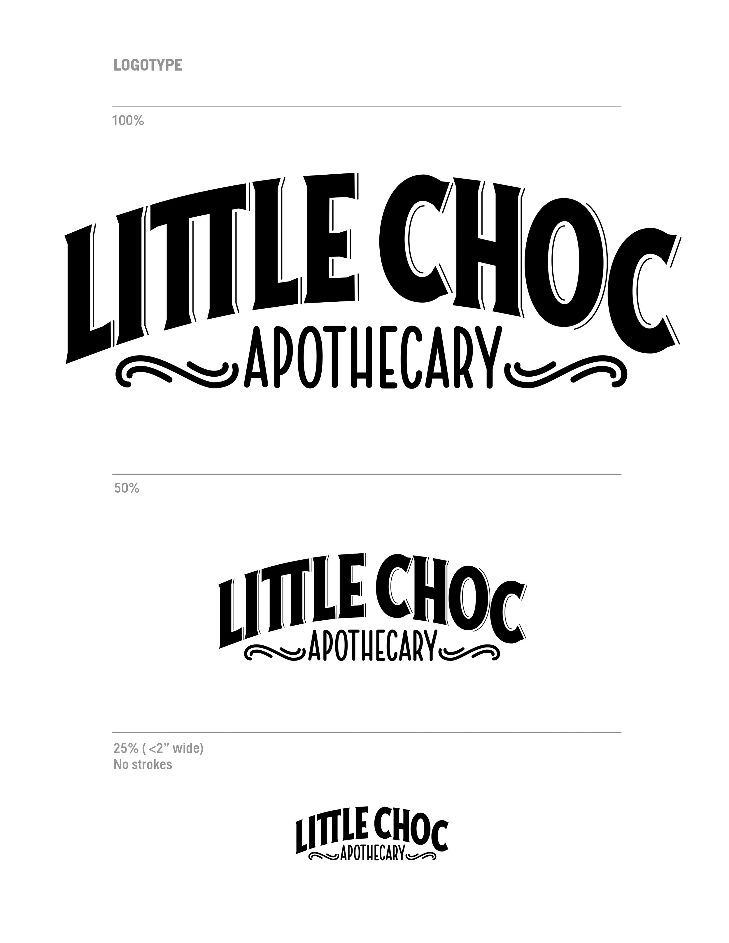
A logotype was created for situations where the image would not work or where the text had to be the center of attention and as large as possible. Similarly to the main logo version, the strokes were removed from the smallest sizes for better printing.

A knock-out version of the logo type made for printing over colored or darker backgrounds.

Finally, an icon-only version was created as well for situations where it could be used as a mark without the need for the text. This is the cafe’s symbol and it could be used on its own.


I was so excited to receive this package with the logo printed on various merchandise! Such a perfect example of the different versions of the logo being used!


